

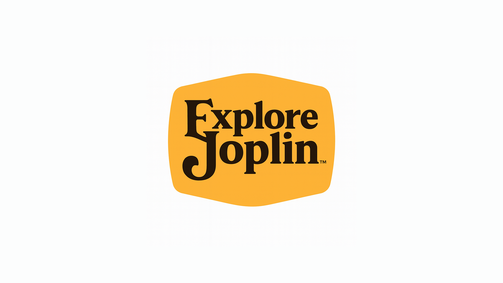

In this spoof post, Explore Joplin unveils a completely fake logo rebrand—crafted in the style of the Cracker Barrel controversy that took over the internet. But instead of hiring a design agency, we let AI handle the entire rebrand story, from design “meaning” to emotional font choices. Spoiler: none of it is real, but all of it is ridiculous. Come for the cornbread jokes, stay for the branding chaos.
This rebrand? Totally fake. But after the whole Cracker Barrel logo drama, we figured we’d have a little fun and let AI write us a rebrand story of our own. Have fun reading!


No listings available
After weeks of deep reflection, one whiteboard meltdown, and an emotional internal Slack thread titled “Logo_gate_final_FINAL_v2,” we finally did it: Explore Joplin has a new logo.
It’s clean. It’s bold. It’s… slightly familiar?
Some folks are saying it “lowkey looks like the Cracker Barrel logo.”
To which we respond: lowkey? Try full-on midwestern legend energy.
This logo isn’t just a vibe—it’s a visual statement that says, “We like biscuits. And branding.”
Let’s dive into the design journey behind the new identity that has everyone saying: “Wait… is that copyrighted?”
We didn’t just pick an orange blob because it was cute.
The organic shape represents the comforting chaos of Downtown Joplin, where nothing is perfectly symmetrical, but everything still feels like home. It’s a nod to Missouri’s rolling hills, the shape of a warm cornbread muffin, and possibly the back of a rocking chair. We’ll never tell.
Also: it fits real nice on a sticker.
We wanted something with weight—like a heavy forkful of chicken-fried steak or the emotional gravity of accidentally calling your teacher “Mom” in third grade.
The font is classic, timeless, and just the right amount of Southern Gothic. The exaggerated “E” and “J” are meant to cradle the rest of the wordmark, just like Joplin cradles our overactive creative energy and love for punchy one-liners.
It’s giving:
Okay, let’s address the rocking chair in the room.
Yes, we’ve heard it.
Yes, we see it.
No, we are not being sued. (Yet.)
But here’s the thing: Cracker Barrel wishes it had this kind of local flavor. Our logo isn’t about syrupy nostalgia for highway rest stops—it’s about small-town swagger, Main Street magic, and that weird mural you walk past every day but never actually stop to look at.
So sure, it’s giving “old-timey breakfast.” But it’s also giving:
Now that we’ve accidentally entered the retro-logo hall of fame, we’re leaning in. Expect merch drops, commemorative mugs, and maybe a few more cheeky design experiments that toe the line between homage and parody.
Also: We’re not changing this for a while. Mostly because the Figma file was a mess and no one remembers where we saved it.
Didn’t read? Joke’s on you—this rebrand is fake. And now buy merch from us.

We're a media company dedicated to celebrating Joplin, through bold storytelling, immersive experiences, and creative innovation. We amplify the city’s culture, businesses, and people—connecting people through engaging content, virtual tours, and curated experiences.

No results available

No results available
No results available

No results available
Subscribe to get updated with new product drops, deals & updates.
No results available
We use cookies to make Explore Joplin faster, smarter, and way more fun. They remember your preferences, speed up load times, and help us show the right stuff to the right people.
No creepy tracking—just good vibes. Curious? Check out our Privacy Policy.